This week’s TidyTuesday data is about Caribou and the tracking of their whereabouts. When I first saw the repo entry I got excited as I thought there’d be a great opportunity to do some classification modeling like can we determine sex based on distance traveled? How do the patterns in their traveling differ as they grow older? Unfortunately, most of the data within individuals are incomplete as that didn’t seem to be the aim of the study.
What we have instead is the opportunity of creating some maps in R. I don’t work with maps in my everyday job as we don’t tend to use location data but thought it would be interesting to try, especially as the last few TidyTuesdays have been good for map plots. Upon reading some articles like this great r-spatial article, I thought I’d try two approaches: one with a simple geom_point (after I already checked the data) and one using a drawn map of British Columbia (which thankfully already has a package).
individuals <- readr::read_csv('https://raw.githubusercontent.com/rfordatascience/tidytuesday/master/data/2020/2020-06-23/individuals.csv')
locations <- readr::read_csv('https://raw.githubusercontent.com/rfordatascience/tidytuesday/master/data/2020/2020-06-23/locations.csv')
Explore
I already looked through the individuals dataset which is when I realised the things I wanted to do weren’t feasible. A quick skimr shows that data completeness is very low and even though we perhaps could do something with the deploy_off_type column, the amount of work in trying to get it working is not worth it.
skimr::skim(individuals)So instead let’s forget about that dataset and instead turn to locations!
nrow(locations)## [1] 249450That is a lot of rows. I don’t think that’ll be a problem for the sf map as it will handle it well but trying to plot 250k points may be an issue. I just want to check if study_site and season are complete:
print(str_c('study_site: ', sum(is.na(locations$study_site)), ', ', 'season: ', sum(is.na(locations$season))))## [1] "study_site: 0, season: 0"All good. As I’m not plotting on a map in my first graph, I don’t care that much for exact accuracy of the location (within reason) so I’m going to round latitude and longitude to 2 decimals. This should reduce a lot of the ‘duplicates’ and make it easier to plot.
locations_deduped <- locations %>%
  mutate(longitude = round(longitude, 2),
         latitude = round(latitude, 2)) %>%
  distinct(season, study_site, longitude, latitude)
That reduces our data to 18k rows which should be more manageable.
Point plot
Now for the plotting part which, to be honest, is very simple as the amount of data draws what looks like a map for us already.
ggplot(locations_deduped) +
  geom_point(aes(longitude, latitude, col = study_site)) +
  theme(legend.position = 'bottom')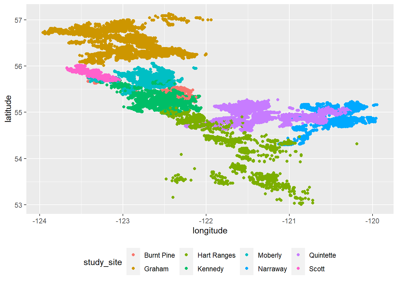
This is a decemt start. One thing I do immediately notice is that Caribou deploying from the Hart Ranges site seem to be all over the place. Strange as proportionally, there aren’t that many entries from that site. Anyway, all I want to do is:
Split by season so we can observe the differences
Reduce size of points
Apply a theme (I read that
theme_void()is a great option for maps)Style until I’m happy with it!
ggplot(locations_deduped) +
  geom_point(aes(longitude, latitude, col = study_site), size = 0.3, alpha = 0.9) +
  gghighlight(unhighlighted_params = list(colour = "#F2EFC7"), use_direct_label = FALSE) +
  palettetown::scale_colour_poke(pokemon = "golbat") +
  guides(colour = guide_legend(title = "Study Site", override.aes = list(size = 4))) +
  facet_wrap(~season, strip.position = "bottom") +
  labs(
    title = "\nSeasonal differences in British Columbian Caribou movement",
    subtitle = "Patterns show that during summer, the different herds are much closer together than during winter.\n Without knowledge of the animal, I assume this is because winter comes with food challenges.\n"
  ) +
  theme_void() +
  theme(
    #plot.background = element_rect(fill = "#D2BBA0"),
    plot.background = element_rect(fill = '#BAD9B5'),
    plot.title = element_text(hjust = 0.1, family = 'opensans', colour = '#442B48', face = 'bold', size = 16),
    plot.subtitle = element_text(hjust = 0.1, family = 'opensans', colour = '#442B48', size = 10),
    #legend.position = c(0.4, 0.8),
    legend.position = c(0.8, 0.7),
    legend.title = element_text(size = 8, family = 'roboto', colour = '#442B48', face = 'bold'),
    legend.text = element_text(size = 8, family = 'roboto', colour = '#442B48'),
    strip.background = element_blank(),
    strip.placement = "outside",
    strip.text = element_text(size = 12, family = 'opensans', colour = '#726E60', face = 'bold')
  )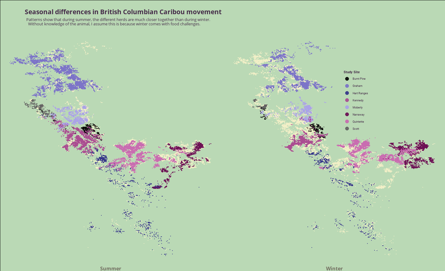
geom_point map faceted by season showing difference in Caribou locations between the seasons.
You can also enlarge the image to see the detail clearer
gghighlight is an amazing package that comes in handy when wanting to quickly highlight certain data that needs to stand out (and I use it daily) but unhighlighted_params is a relatively new feature and not used very much yet. It’s very useful and helps us draw the points that don’t have a study_site appointed so we end up with the same map on both sides, even if the data points are different.
Don’t have much to say about the data as I don’t know a lot about Caribou (or British Columbia) but I find it interesting that the Caribou take up so much more real estate during the summer whereas during the winter there are big stretches of land that are left unattended. I really like the plot though and I think if there is no necessity to draw a map, geom_point seems like the perfect approach.
Map plot
I also wanted to try a map plot which I’m only able to do because of the amazing bcgov team that put together the package. As part of the package, there’s a function transform_bc_albers() that will help us transform an sf object to a BC Albers projection. Of course, to do that, need to get the dataset into an sf object first!
library(sf)

sf_locations <- locations %>%
  select(study_site, season, latitude, longitude) %>%
  st_as_sf(coords = c("longitude", "latitude")) %>%
  st_set_crs(4326)
For me, the most difficult part to wrap my head around was st_set_crs(). All of the examples I saw (and I read many articles!) simply used st_set_crs(4326) but I couldn’t find out what the 4326 was referring to. Turns out it was very simple.. just not for someone who never uses maps! It refers to the World Geodetic System
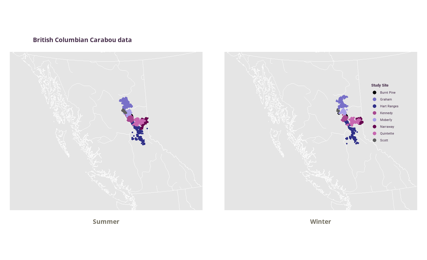
geom_sf map faceted by season showing difference in Caribou locations between the seasons
Changes are much less obvious between the two seasons in this plot but it’s nice to have the backdrop of BC. Makes you realise how little of the space they actually occupy. Can still see that they are more likely to ‘clump’ during summer time! I’m not going to change any more to the graph but I think to make it better I would just forego the facet altogether.
This was another great TidyTuesday dataset. I definitely learnt a lot about how to use geom_sf and I liked the playing around with the styles for the geom_point() plot. Bit disappointed I couldn’t do the classification model and maps aren’t really my thing but had put off doing any of the recent TT’s due to their focus on location data (although there were some historically signicant datasets in there that people need to check out).